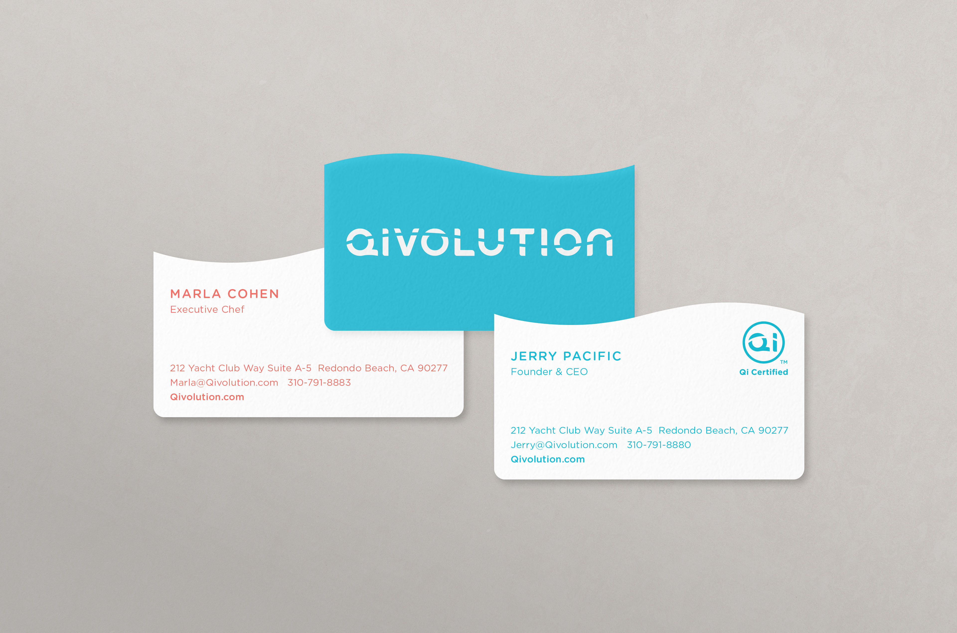
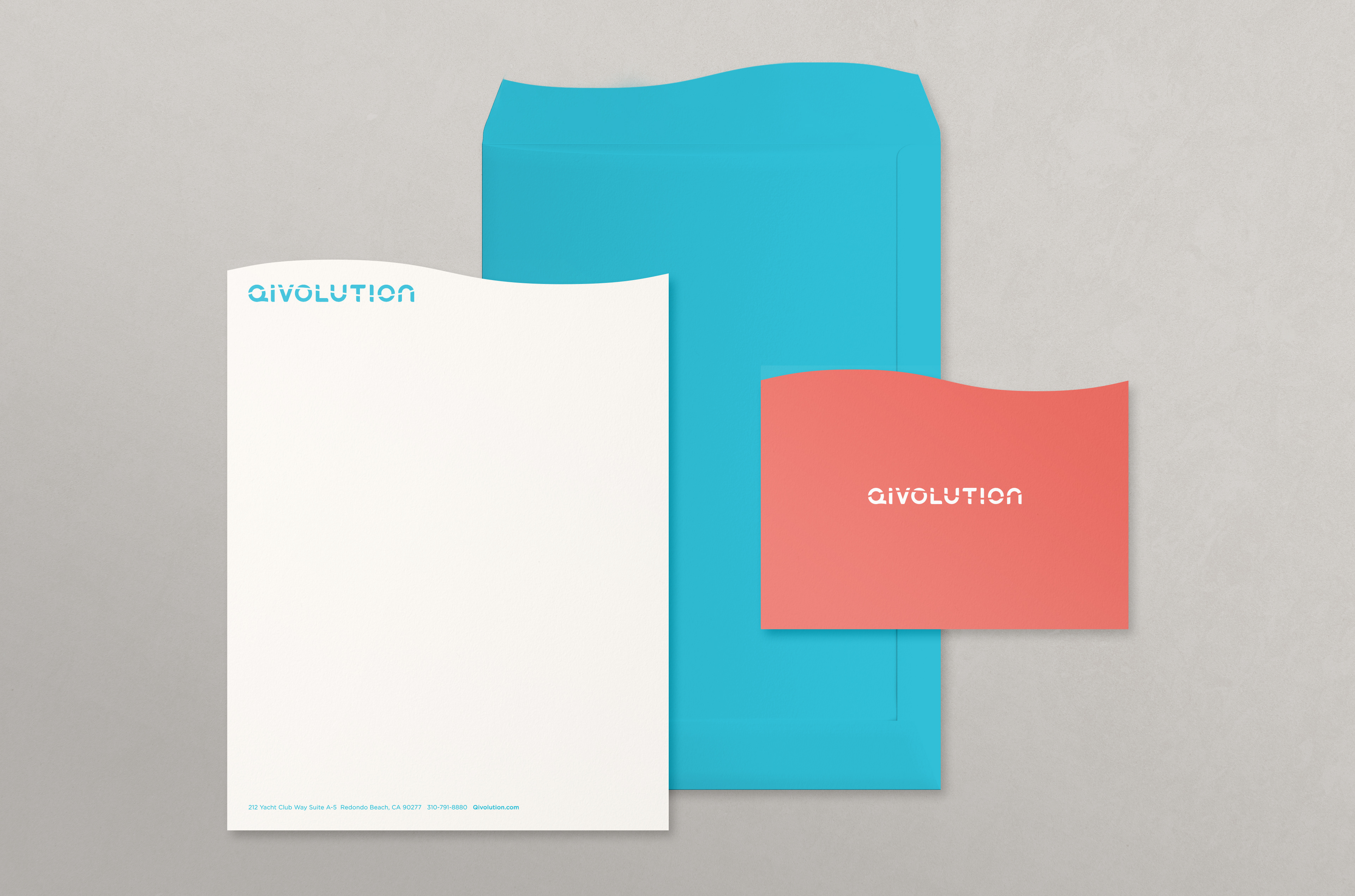
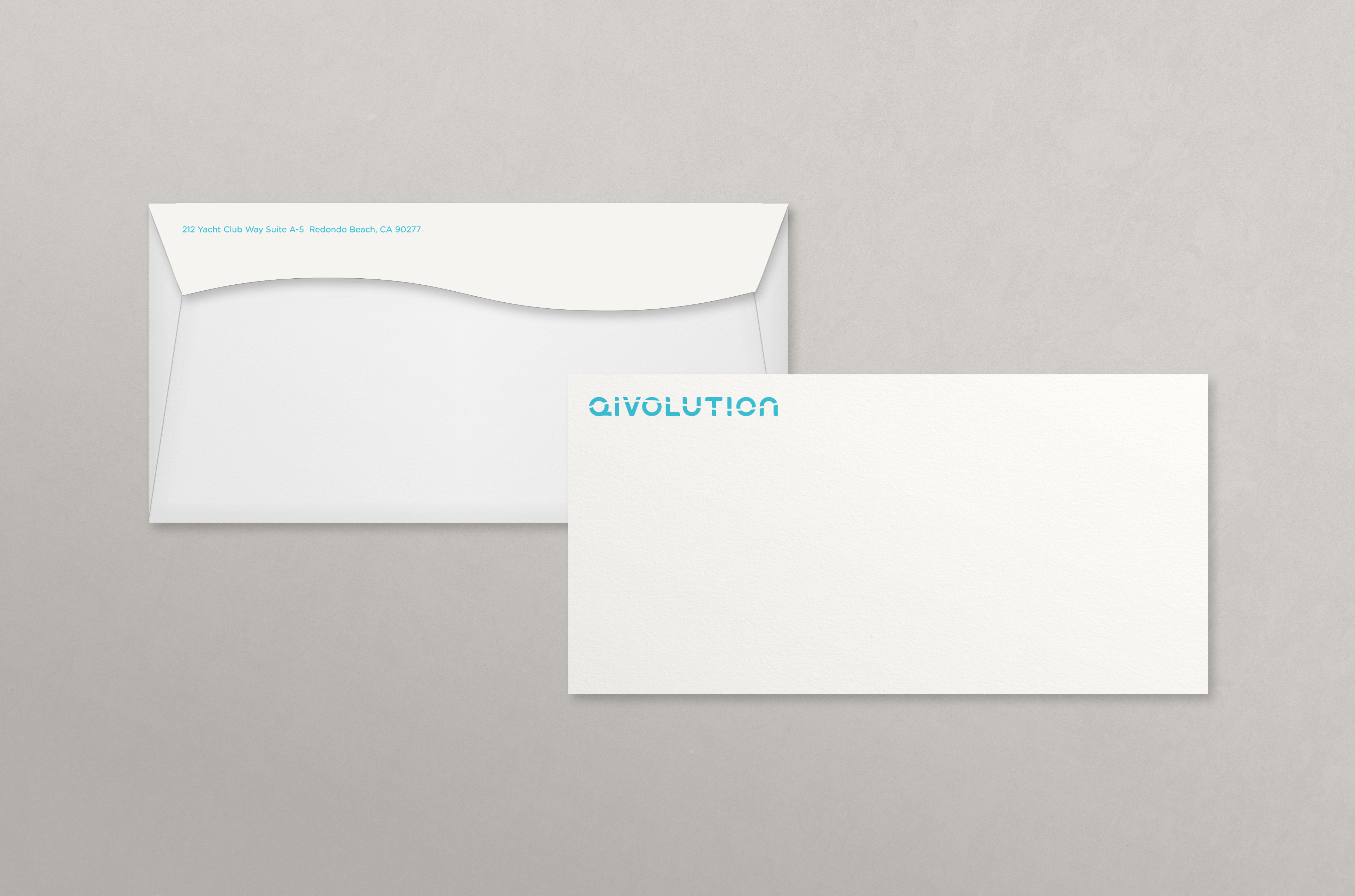
Corporate stationery and print collateral for Qivo Snacks’ parent company. The identity draws from the concept of Qi, Yin, and Yang, exploring balance and duality. A curved wave form derived from the Qivolution logo expresses this equilibrium—balancing motion and openness—while a Yin-Yang–inspired color palette reinforces this balance across the system. Applied across print applications.